“Using Adobe InDesign, rethink the former menu from Paradise Creek Brewery in Pullman, WA so the visual hierarchy is more clear. Consider how use of typography (fonts)—as well as choices concerning scale, positioning, spacing, alignment, and color—affect your understanding of the content.”
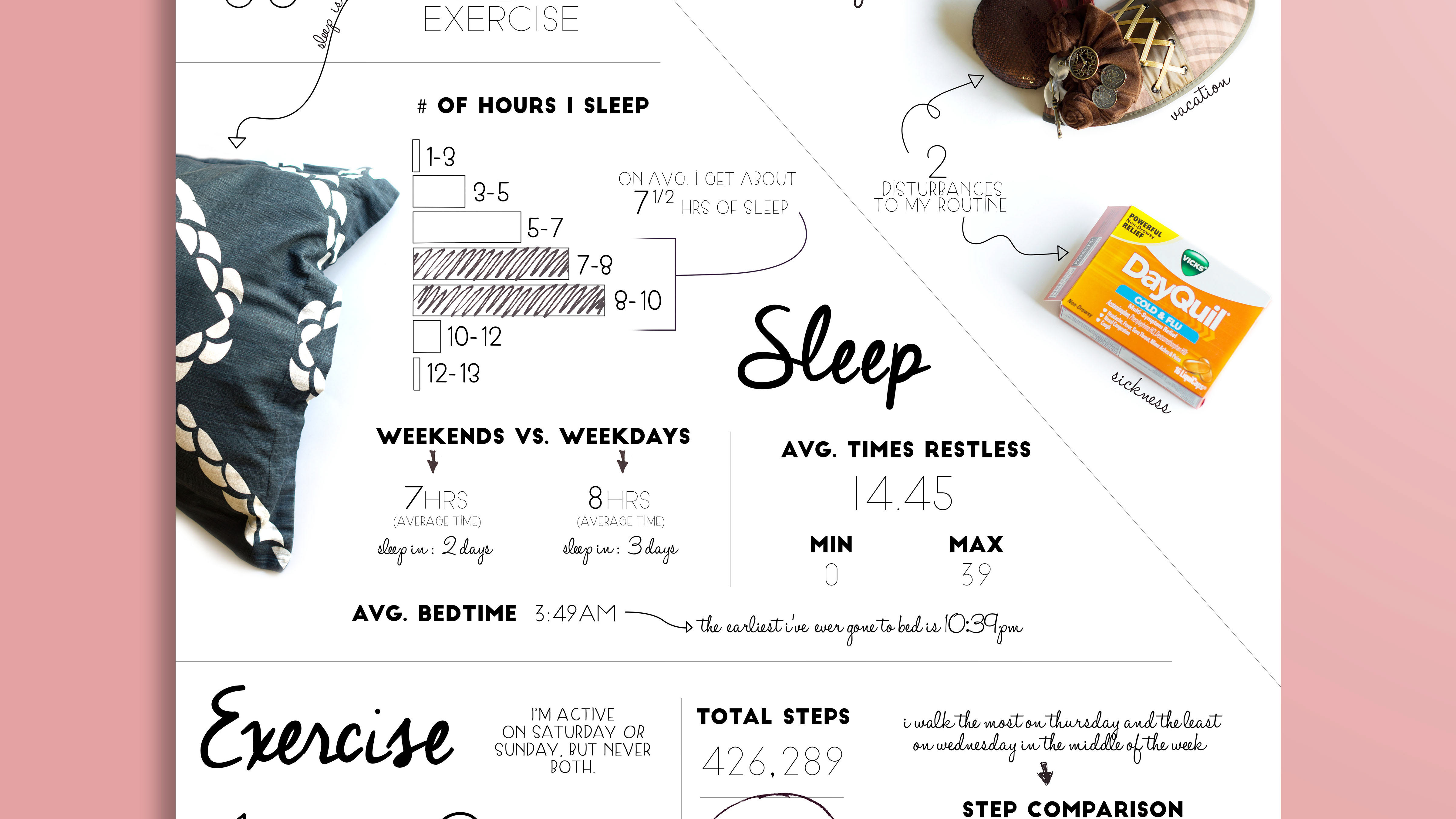
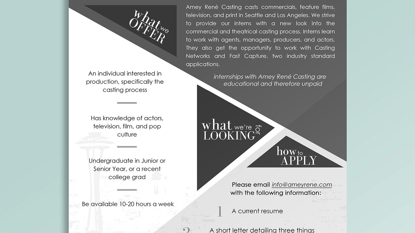
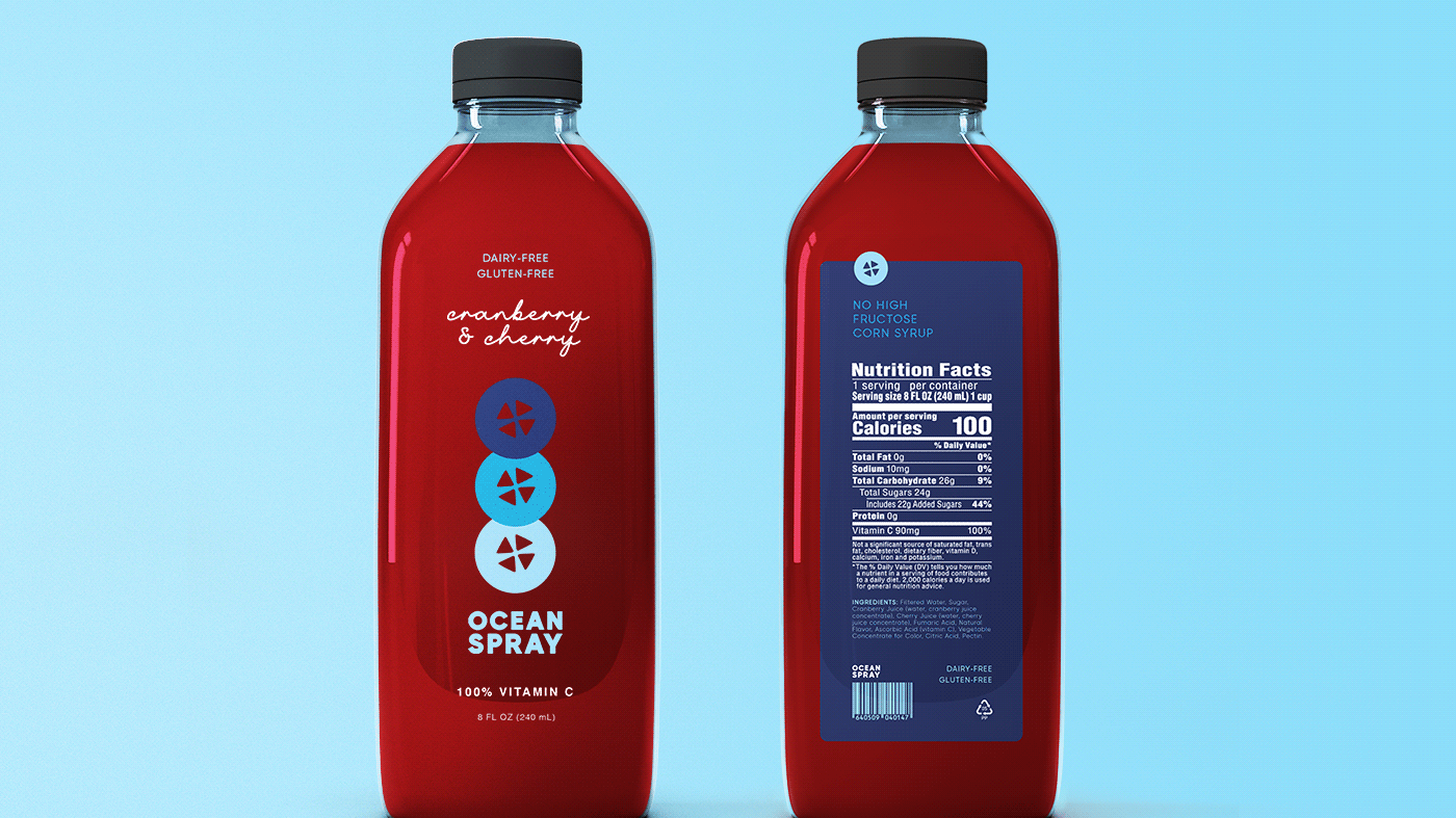
The first image is my redesign and the last two are the original menu design. I focused on keeping the elements that made sense like the distressed boxes, and got rid of the chaos that comes from more than 2-3 fonts.
—
Class: Composition and Design (DTC 336) // Professor: Kristin Becker
Paradise Creek Brewery: http://paradisecreekbrewery.com/index.html
